GTI Group
Unifying and supercharging an international logistics brand.
Program
- Brand Transformation
- 5-month engagement

Enter GTI.
After being acquired by private equity fund Novacap and successfully reorganizing GTI USA, Precision Specialized, Nomade Transport, and Jetco Delivery under the GTI Group parent, the newly reimagined GTI found itself at a moment of transformation.
Without a brand roadmap to guide them, and with prior research that had yet to be synthesized, GTI wasn’t sure exactly what to do next.
In order to arrive at a brand structure that worked for them—and to usher in their future—GTI tapped Thrive for help.
- Brand architecture
- Research synthesis
- Marketing strategy
- Visual design
- Content design & strategy
- Custom Hubspot development

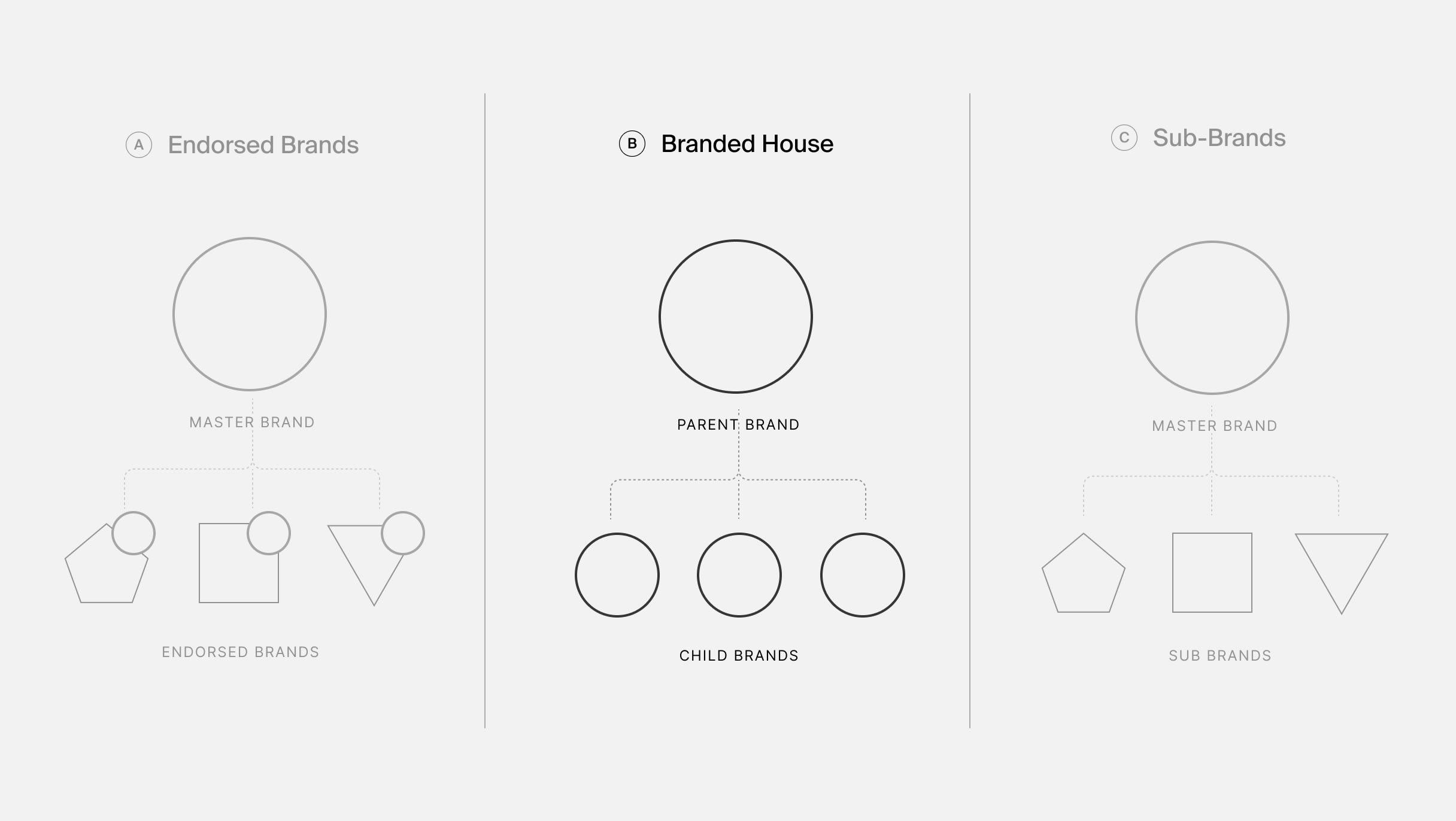
GTI’s private equity ownership team needed to organize and elevate the GTI family of companies so it felt like one cohesive brand versus disparate individual entities. After exploring three brand architecture models with the GTI team, including the Endorsed Brand and House of Brands formats, we settled on a Branded House structure that allowed us the freedom to develop a strong corporate identity that could make an attractive option to potential suitors down the road.
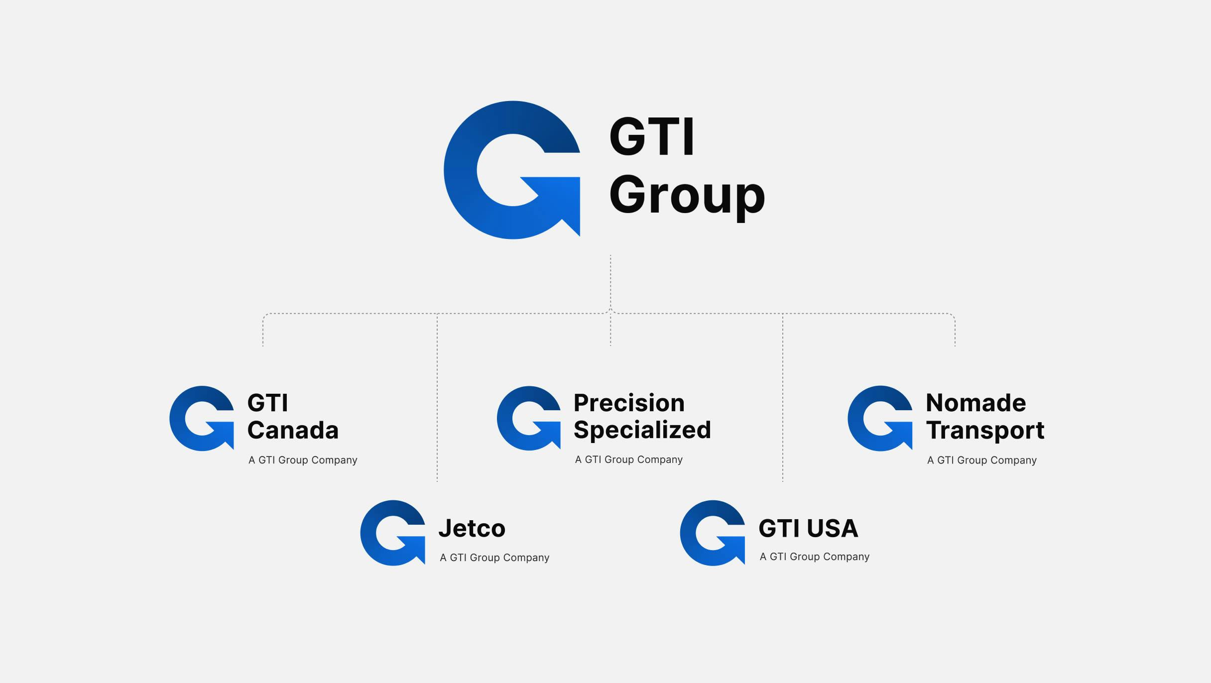
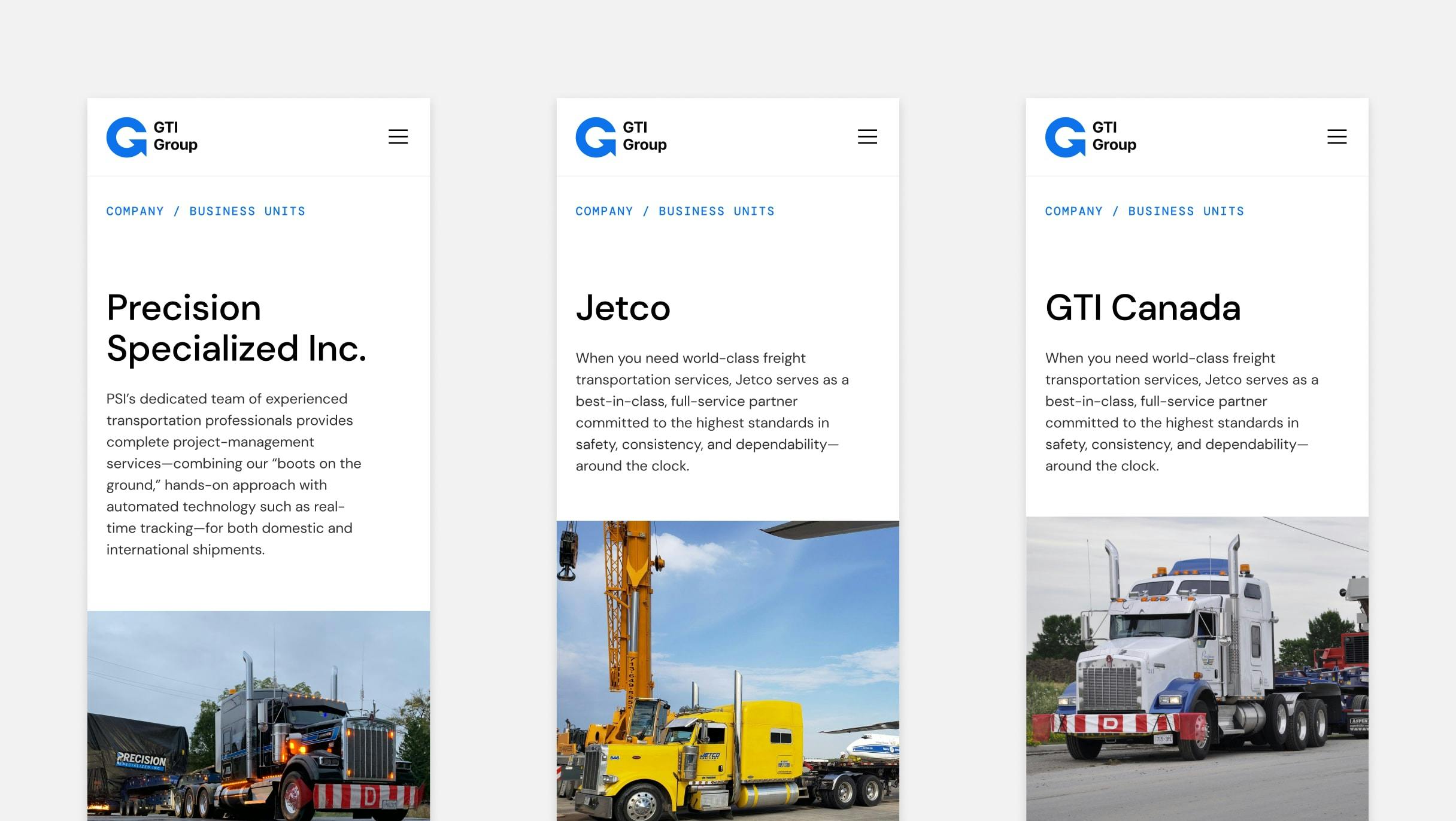
Designing a brand identity system that could expand as additional companies were acquired in the future was of the utmost importance. Not only did the identity system have to evoke trustworthiness, reliability, and safety at every point of interaction with the customer, but the identity system had to also consider future acquisitions to ensure that new member companies could be easily and quickly assimilated into the new brand.
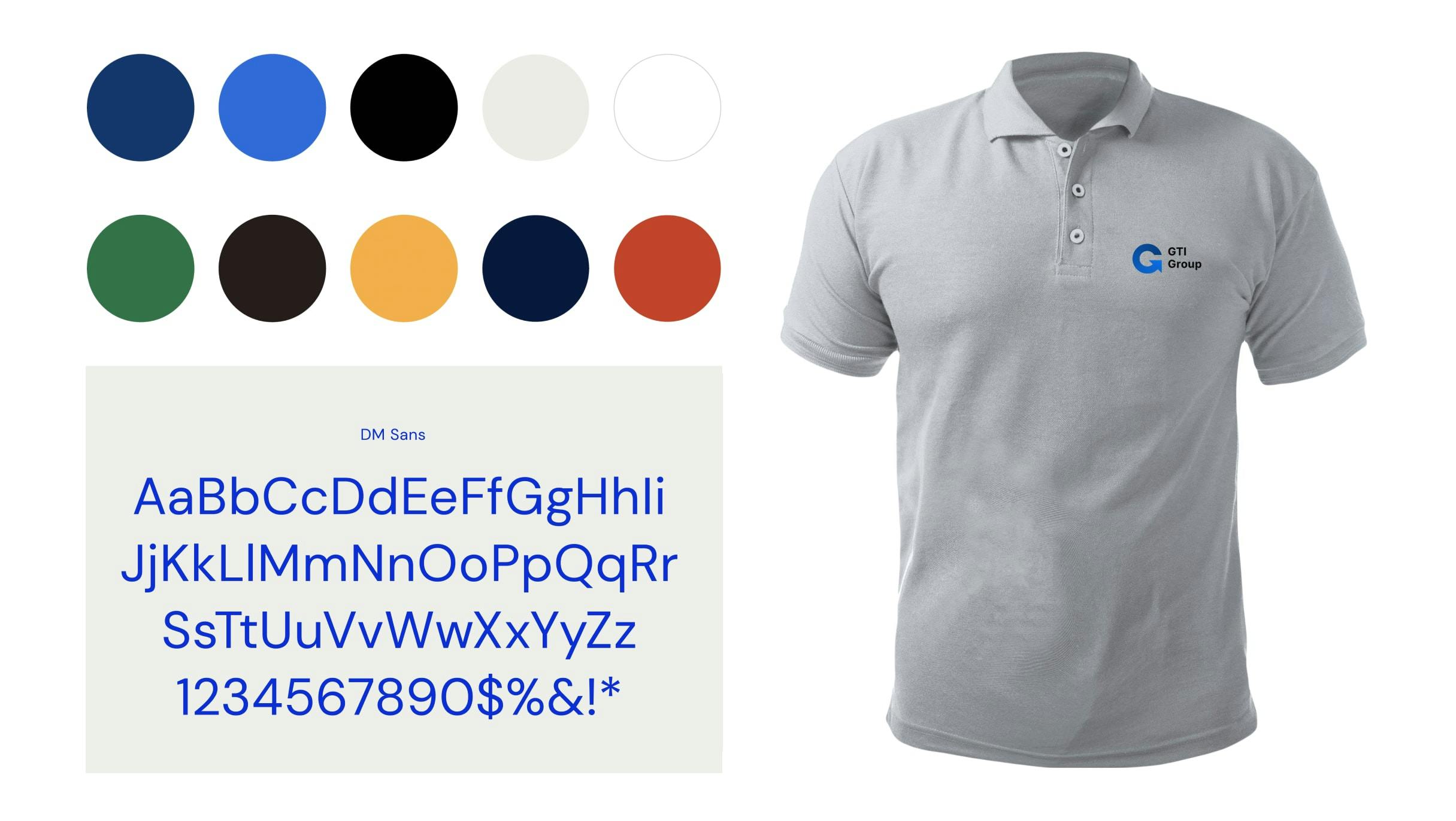
We began the design process by evolving the GTI masterbrand and rebranding the affiliated sub-brands so they carried forth the shared family commitments, promises, and values, and felt like true members of the GTI family. In order to do this effectively, we looked first to the previously executed brand strategy research and selected a number of insights for inspiration.
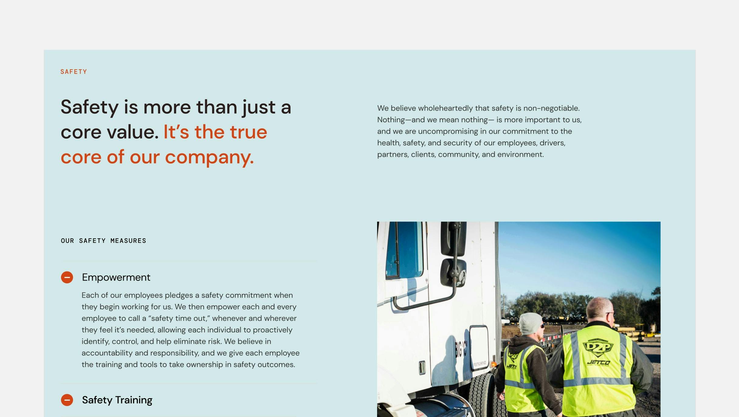
- We always put safety first
- We always act with a sense of urgency
- We believe our customers evaluate our brand with every interaction
- We believe we are a reflection of our customer to their customer
- We exist to make the lives of our customers and their customers secure and predictable
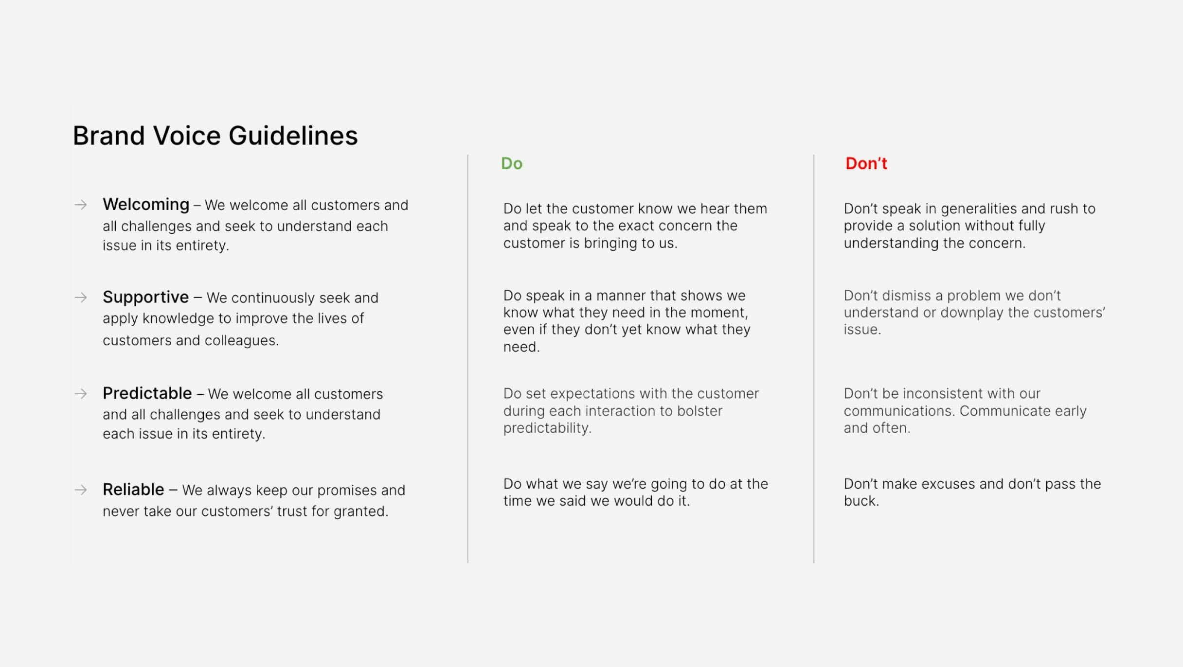
These considerations—sometimes subtle, sometimes more apparent—showed up in both the verbal and visual identities, including the new brand narrative.
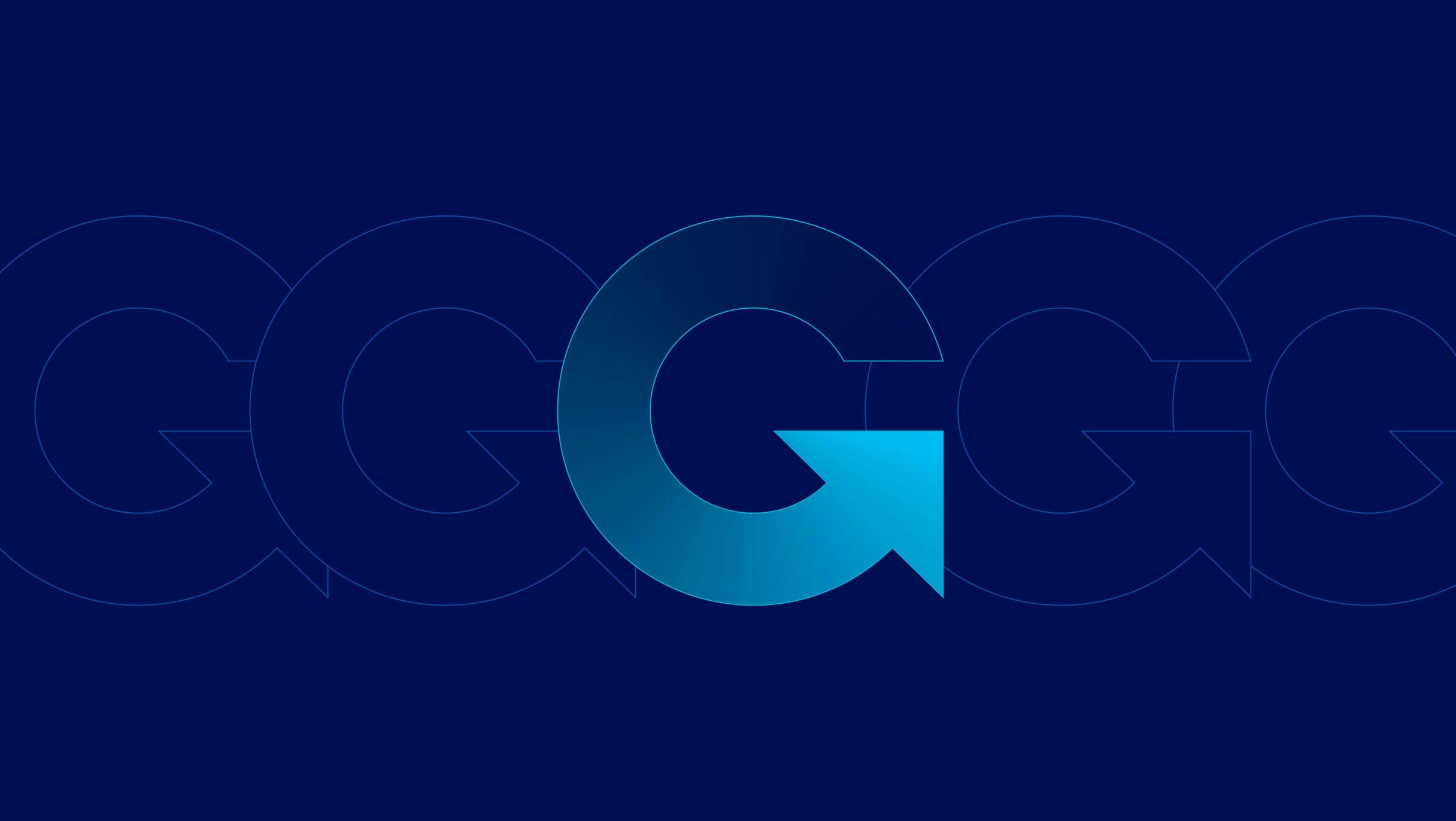
In the final GTI mark, we used the G as a monogram to gesture toward the G in “GTI” as well as to communicate the flow of goods and materials being shipped. The arrow at the end of the G, slightly turned up, helps communicate elevation— whether it’s the elevation of the Group itself or the forward progress GTI helps enable for its clients.
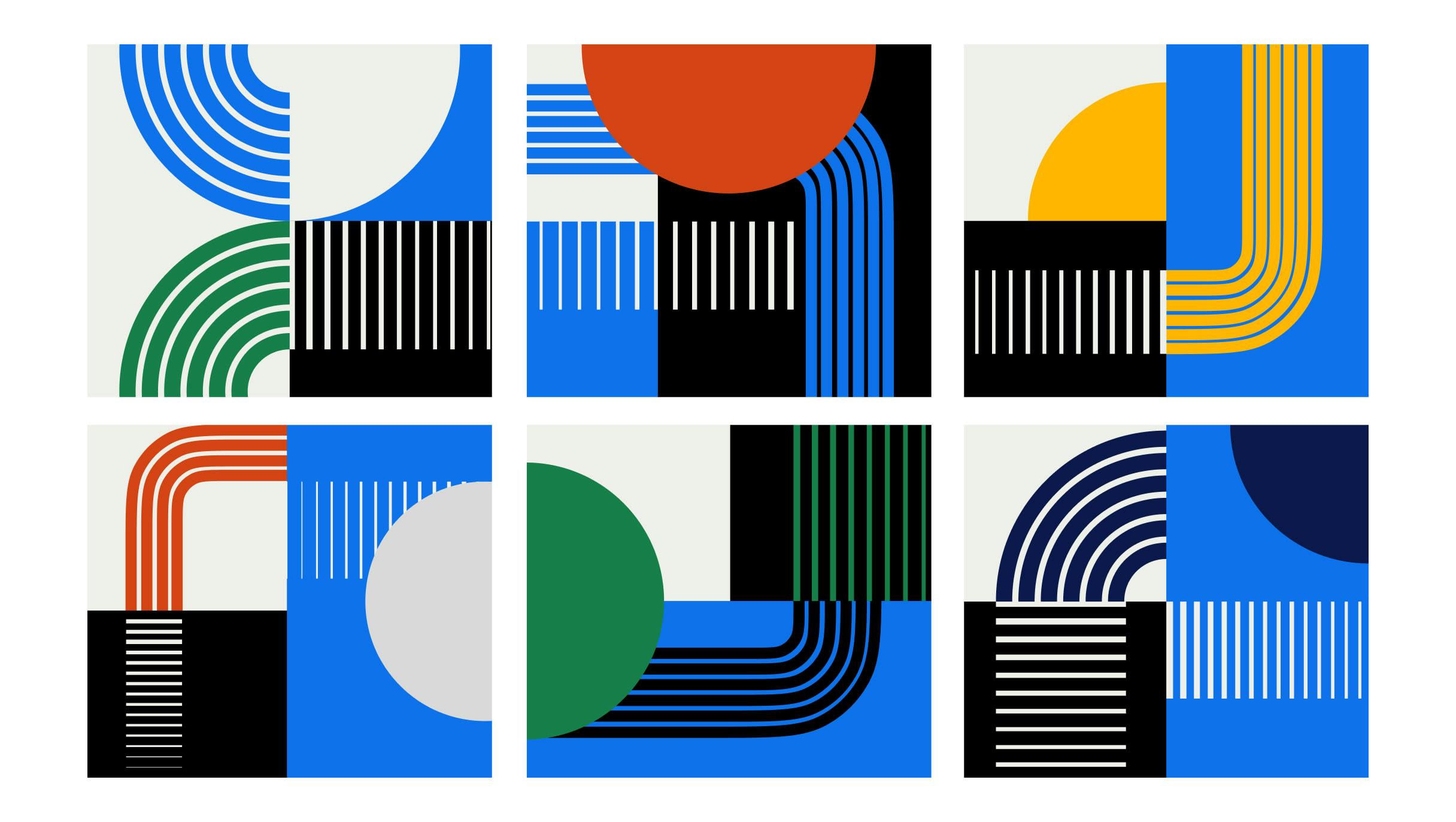
By solidifying patterns across the design system, we were able to create a useful way to differentiate between GTI’s various transport solutions, while symbolizing the connection between roads, rails, and ships that allow us to distribute goods across the world. Using a comprehensive color palette, lines with varying stroke weight, and visually interesting background fills, we designed a system of meaningful, repeating elements.
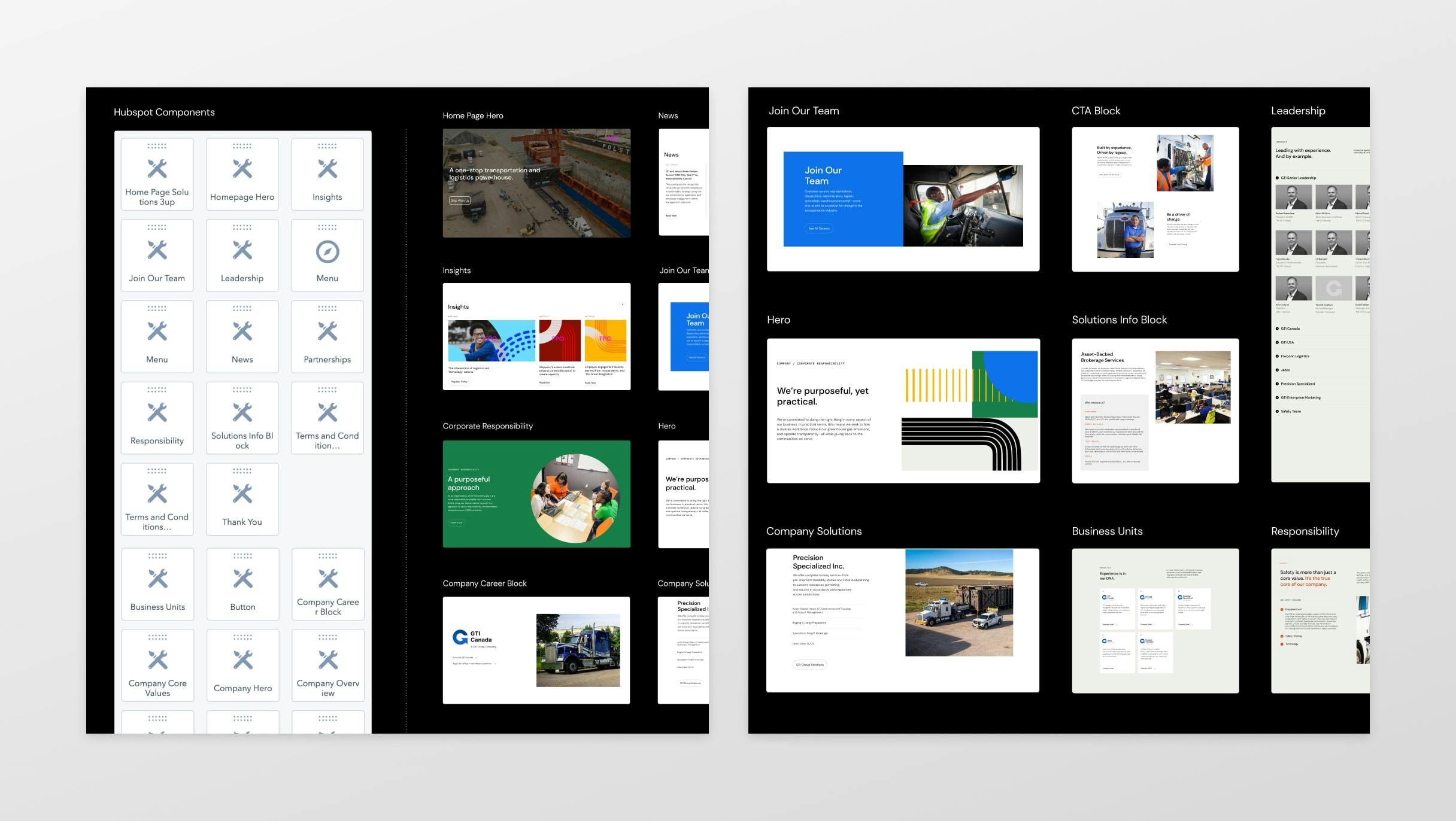
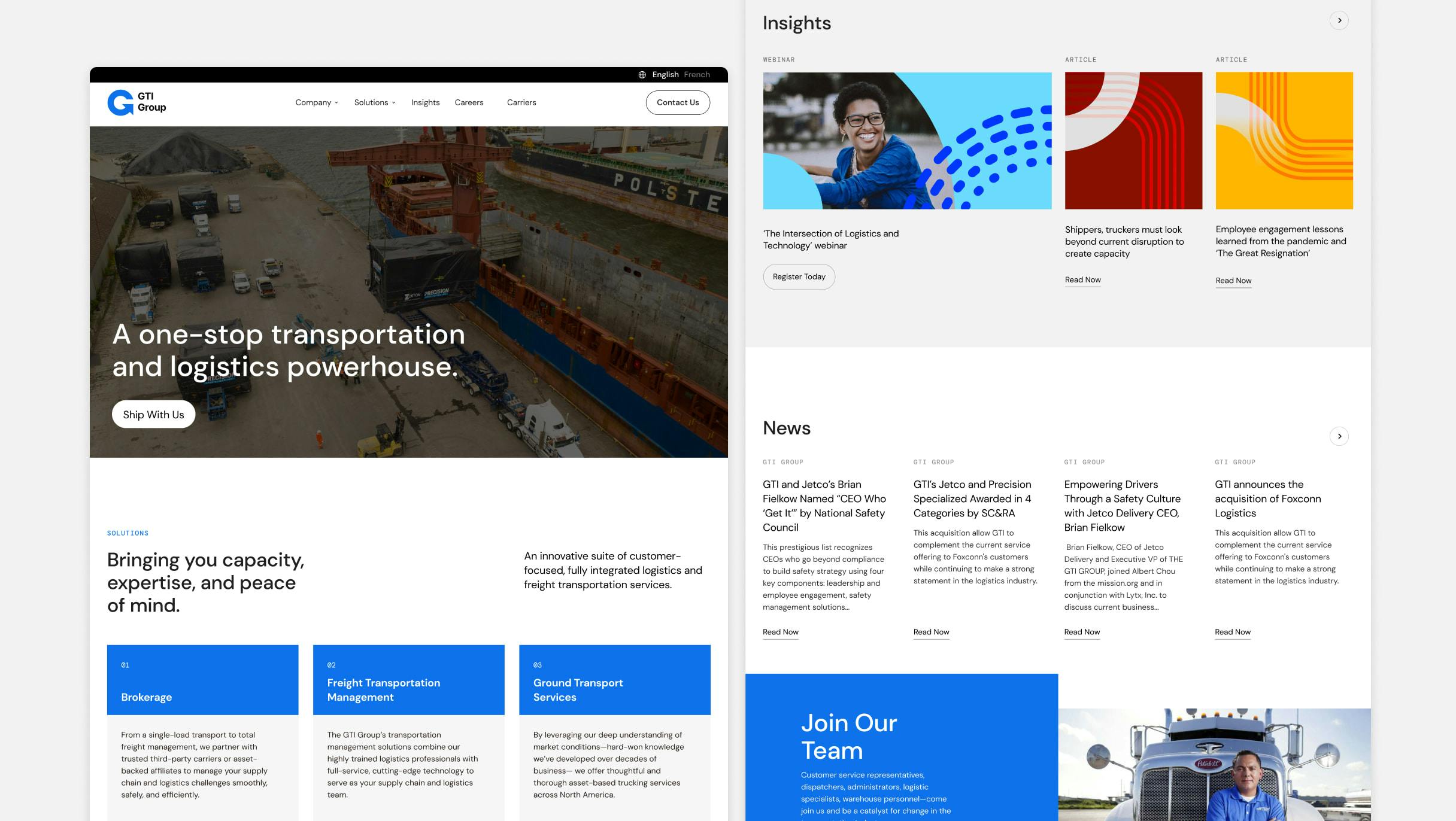
As a sales-driven organization, GTI required that the site be built on the Hubspot CMS to ensure all their previous marketing efforts, lists, and landing pages remained intact—and so they could easily track both inbound and outbound marketing efforts going forward. After solidifying the content strategy and headline structure—which centered on clarity and concision while also highlighting the company’s forward-thinking approach and legacy—we expressed GTI’s new brand by introducing a component-based design system that allows for additional brands to be added in the future.
